
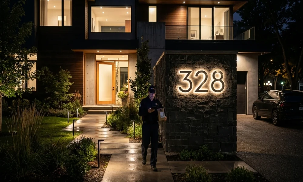
Numbers on houses can be easily missed. They can make a surprising impression on the front of the house, even if they only take up a small space on a house’s wall. Whether it’s a sleek set of numbers next to a front door or warm, traditional lettering, a touch of style can enhance a modern facade or a classic home. If selected carefully, address numbers become a part of the exterior and not an afterthought.
A thoughtful address number design can help tie together the visual elements around a home’s entrance. The style of the numbers can complement the front door, exterior lighting, mailbox, and surrounding materials while adding a subtle point of interest. By considering visibility, scale, colour, and finish together, homeowners can create an address display that is both practical and consistent with the character of the property.
A little detail that sets the tone
Often the first impression of any house is made from the entrance, and house numbers contribute to the character of the house. Imagine tall, slim numbers mounted beside a charcoal-coloured door. The effect is crisp and contemporary. Replace those with round, ornate numbers on a wooden plaque and the same entrance might seem a lot more relaxed and traditional. That’s the magic of typography and proportion. With no change in the architecture, the right numbers can play a role in subtly changing the tone.
Choose the style of the home to match.
When picking out address numbers, a home’s architecture provides helpful hints. Simple shapes and fonts go well with clean-lined properties. Old-fashioned serif numbers are great for traditional brick houses, and handmade or slightly vintage numbers are a lovely choice for cottages and farmhouse-style houses. The aim isn’t to create a perfect match. Rather, choose a style that feels at home. Too elaborate a number plaque can appear unnatural next to an ultra-modern entrance, and vice versa.
Size and Placement Matter
Even if it’s a beautiful design, if the numbers are hard to see, it won’t matter much. Sizing should be considered based on the entrance, façade and viewing distance. Small numbers can get lost in the brickwork, plants, or design elements. However, large numbers can be overwhelming in a small doorway. Placement is as important. The placement of a sign beside the door, above the entrance, on a gate or mounted near the driveway can all have a different visual impact.
Add character using Material.
The material and finish may add another touch of personality. Brushed metal will have a polished, contemporary appearance, while aged bronze will give an established, timeless look. Wood adds warmth and texture, especially in combination with natural doors or stone walls. Consider how the surface will reflect, refract, and absorb sunlight, shadows, and neighbouring colours. Even basic numbers can be striking with a finish that catches a bit of the morning light.
`Include Readability as a part of the Design.
The trick to style is to never sacrifice function for form. The numbers stand out well from the background, especially from the road, so that the address can be seen. Helpful lettering, good spacing and good size. The best design is one that is both unique and easily understood.